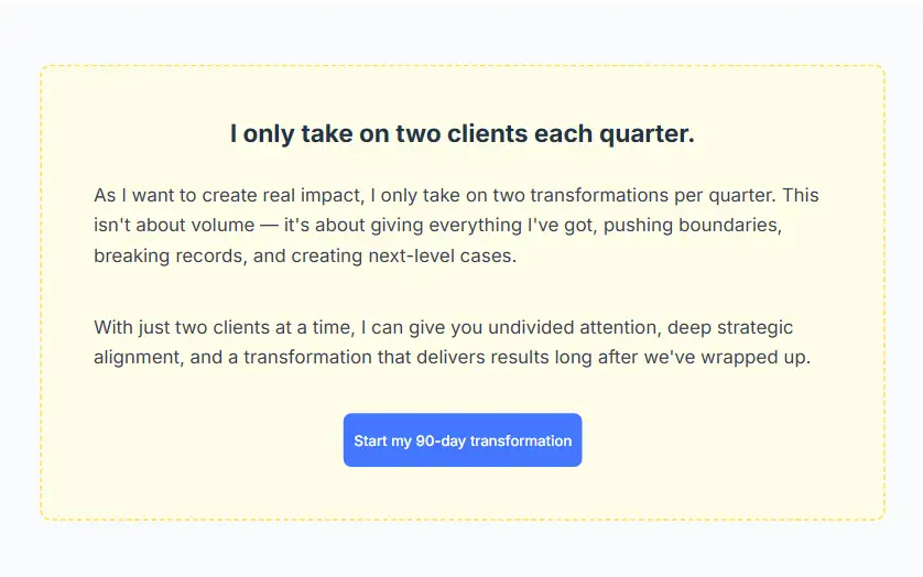
A key challenge was implementing decorative elements and visual accents, lines, and overlapping components, while maintaining precise positioning. Special attention was required to ensure these elements remained consistent and responsive across different screen sizes without breaking the layout.

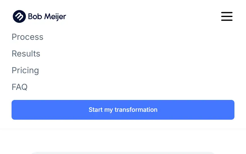
This feature presents a mobile navigation menu designed for clarity and usability on smaller screens. The layout prioritizes key navigation links and includes a prominent call-to-action button, guiding users toward the primary goal. Clear spacing, typography, and hierarchy ensure an intuitive and easy-to-use mobile experience.
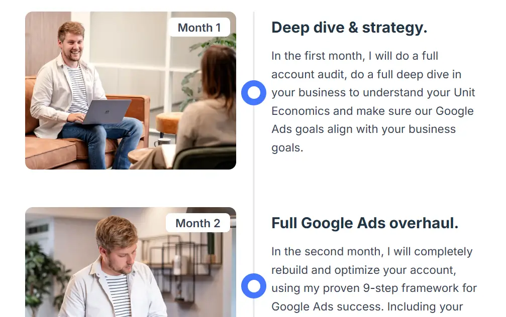
This feature presents a structured timeline layout designed to guide users through a step-by-step process. The section combines images and text with a central visual indicator, creating a clear flow and helping users easily follow each stage.

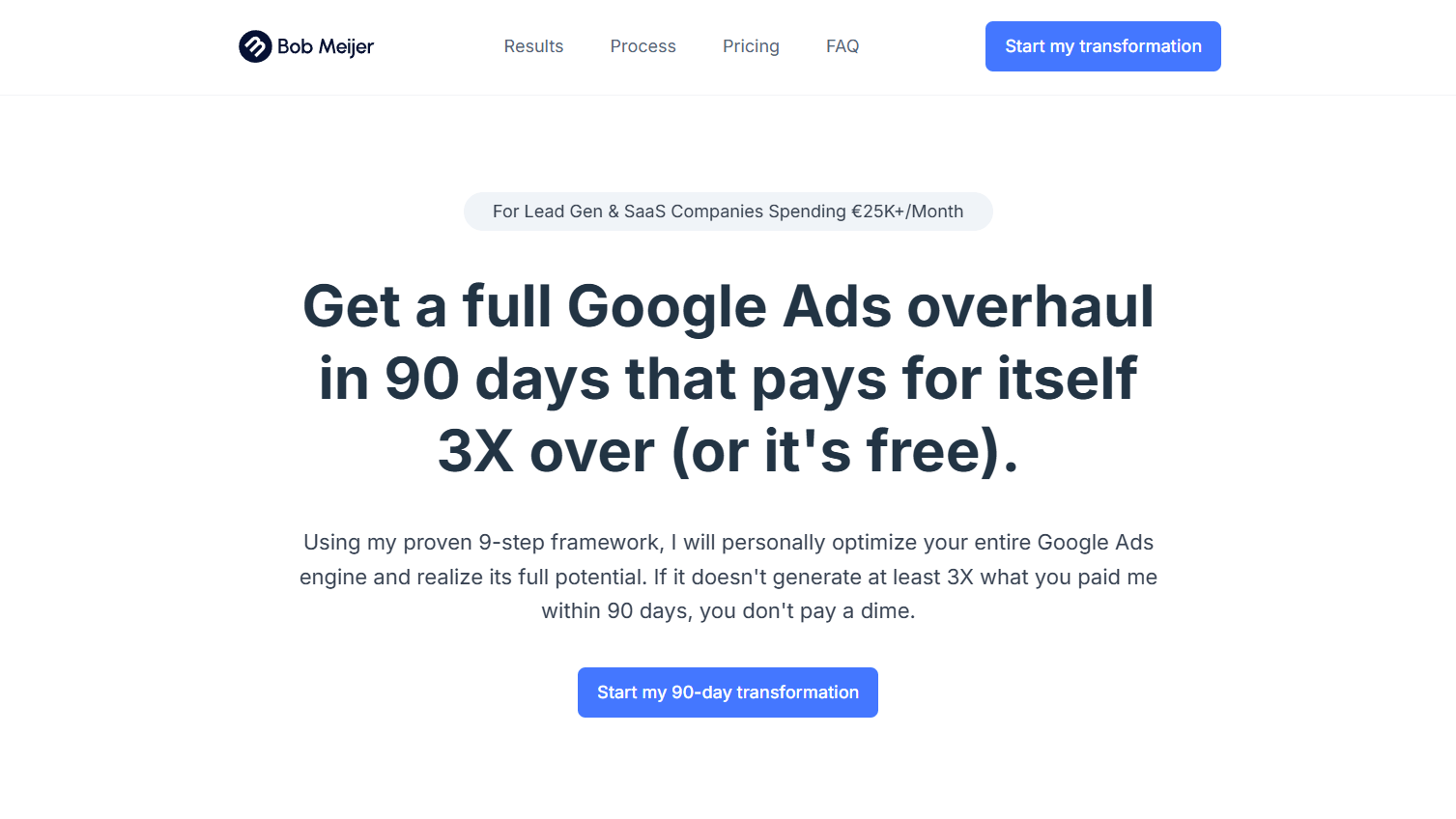
The visuals are focused on clarity, trust, and conversion, using a clean layout, strong hierarchy, and minimal color palette. Content is structured into clear sections that guide the user through the process step by step, while subtle highlights and call-to-action elements help direct attention and encourage engagement.
I specialize in transforming complex design visions into fluid, high-performance Webflow sites. From custom interactions to clean, scalable CMS structures, I bridge the gap between creative strategy and technical execution.
View live site