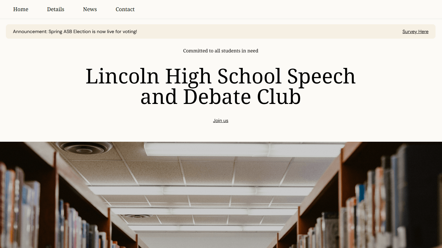
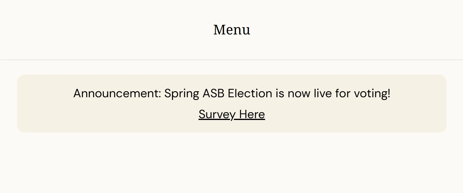
A key challenge was implementing overlapping elements using absolute positioning, while maintaining proper alignment and spacing across different screen sizes. Special attention was required to ensure that layered components, such as the announcement banner and hero content, remained visually balanced and readable
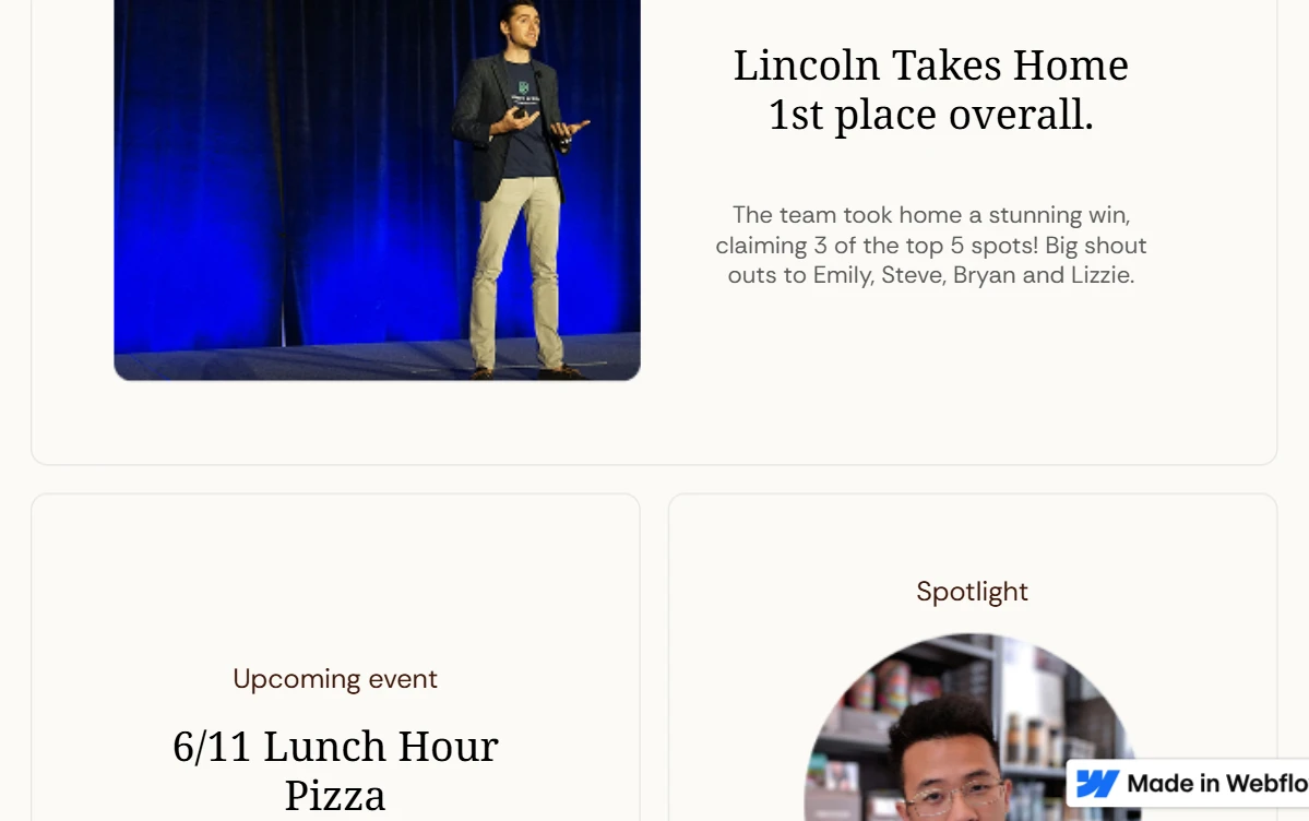
This feature presents a card-based layout used to organize different types of content in a clear and structured way. Each card highlights key information such as events, results, or featured content, making it easy for users to scan and navigate.
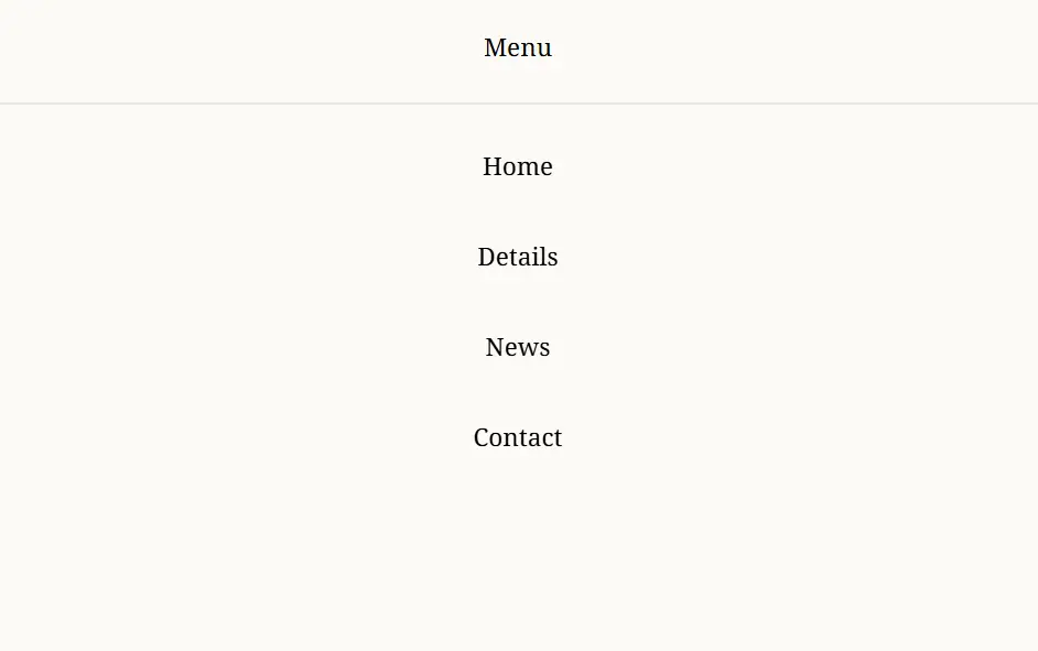
This feature presents a full-screen navigation menu designed for simplicity and clarity. The layout focuses on large, well-spaced links, making navigation intuitive and easy to scan. A minimal design approach removes distractions and keeps the user’s attention on the core navigation options.
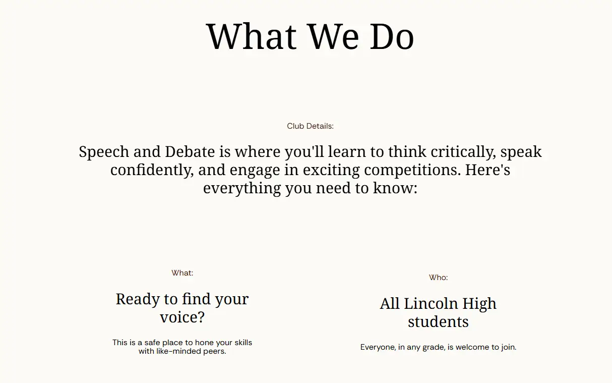
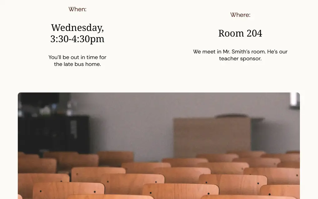
The visuals focus on clarity and structure, using typography and spacing to present information in a clean and accessible way. Large headings, centered content, and minimal design elements help guide the user through key information such as activities, schedule, and participation details.
I specialize in transforming complex design visions into fluid, high-performance Webflow sites. From custom interactions to clean, scalable CMS structures, I bridge the gap between creative strategy and technical execution.
View live site