
A key challenge was implementing alternating layouts with image and text blocks, ensuring proper alignment, spacing, and balance across different screen sizes. Special attention was given to handling large illustrations, rounded containers, and maintaining consistent spacing while adapting the layout for responsive behavior.

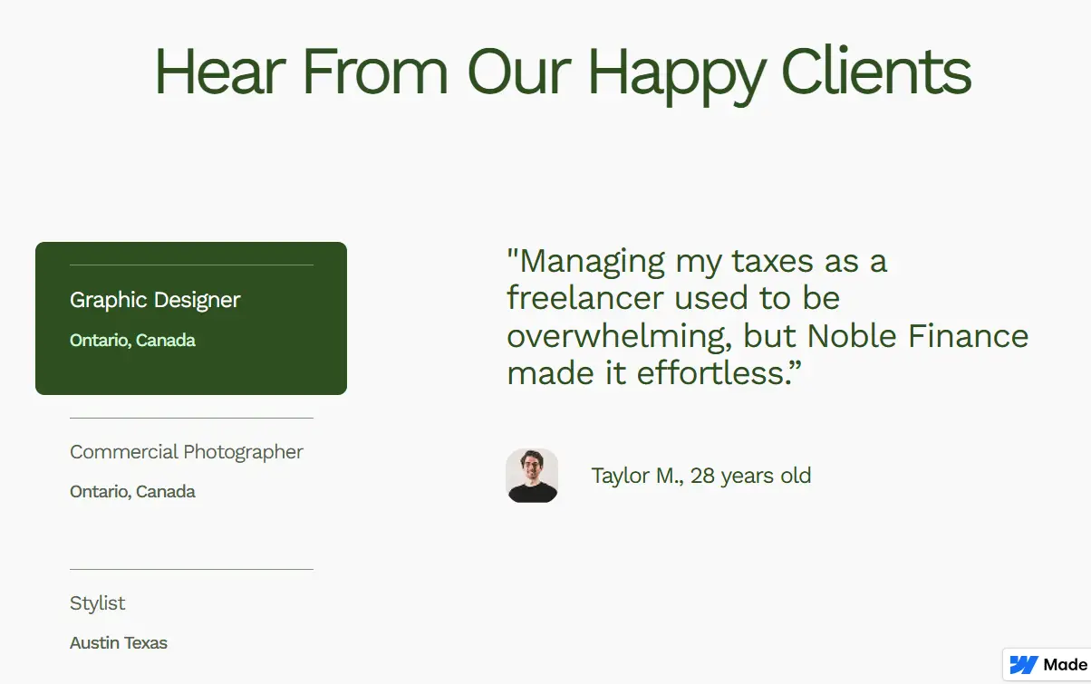
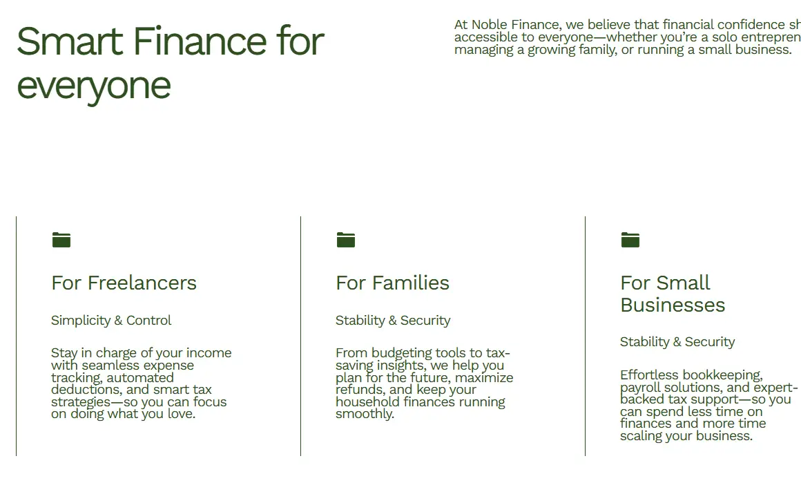
The section separates supporting information and main content into distinct columns, creating a strong visual hierarchy and improving readability. Consistent spacing and alignment were used to ensure the layout remains clean and well-organized across different screen sizes.
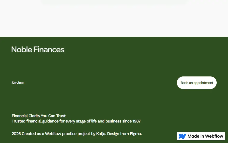
This feature showcases a responsive footer built using CSS Grid, designed to maintain structure and clarity across different screen sizes. The layout organizes content such as navigation, branding, and call-to-action elements into a flexible grid system that adapts smoothly from desktop to mobile.

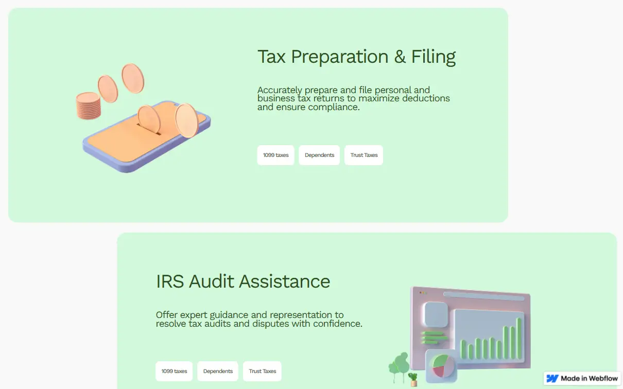
The visuals focus on a clean and approachable design, combining soft colors, strong typography, and structured layouts to create a modern and user-friendly experience. Clear sections and card-based elements help organize content, while illustrations and subtle design details add personality and visual interest.
I specialize in transforming complex design visions into fluid, high-performance Webflow sites. From custom interactions to clean, scalable CMS structures, I bridge the gap between creative strategy and technical execution.
View live site