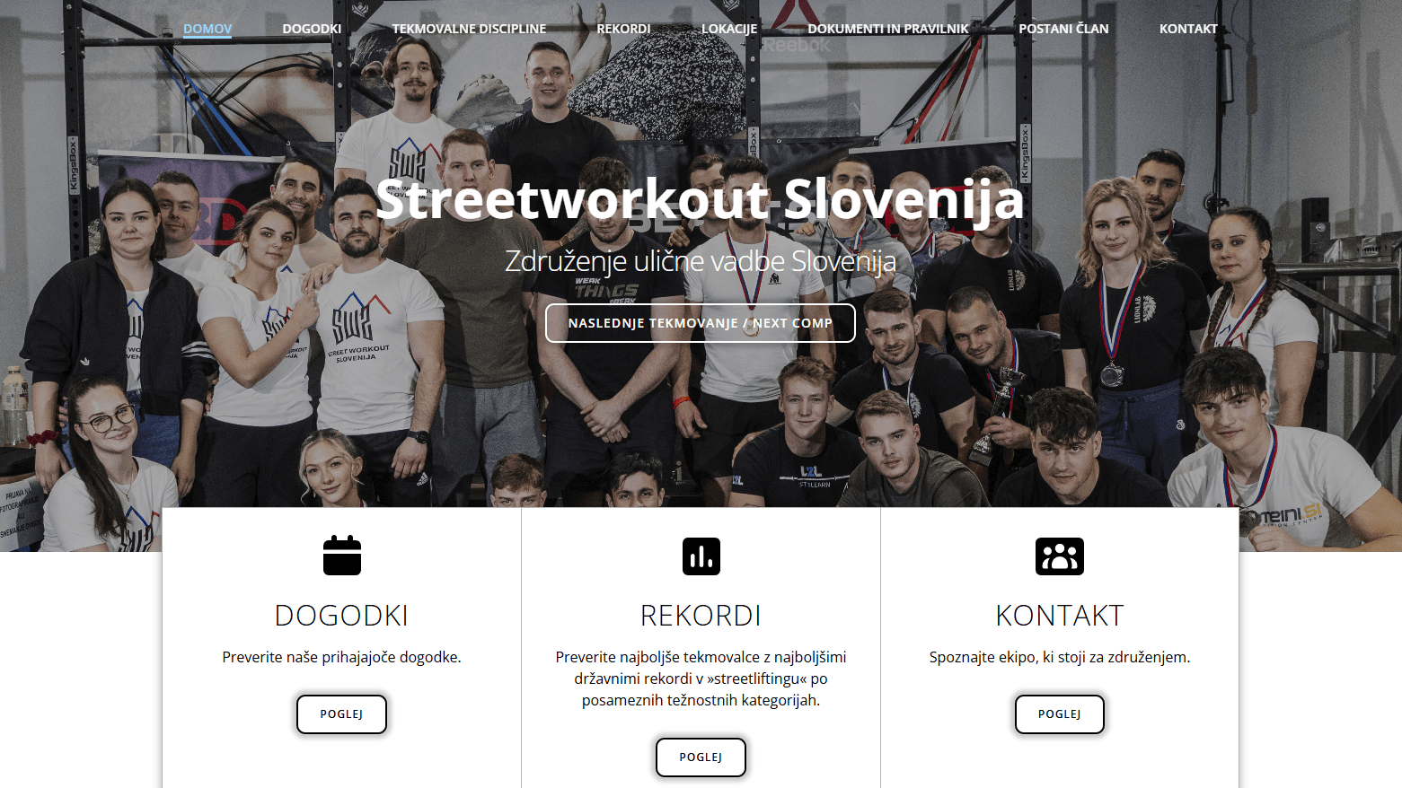
A key challenge was rebuilding a complex hero section with a background slider, ensuring smooth transitions while maintaining readability of overlay content and navigation. The goal was to translate the existing design into a clean and scalable Webflow structure, while improving consistency, spacing, and overall user experience across different screen sizes.
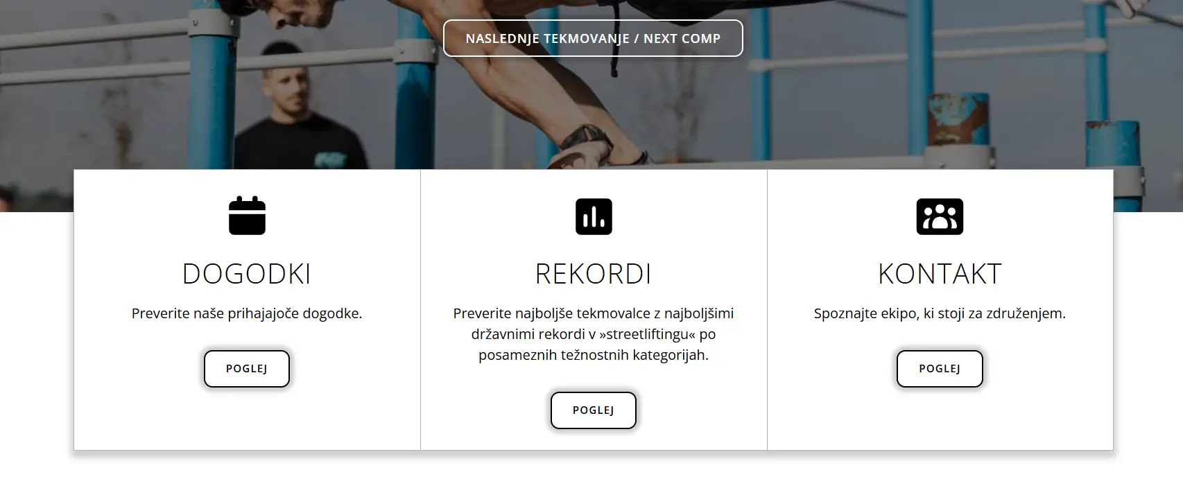
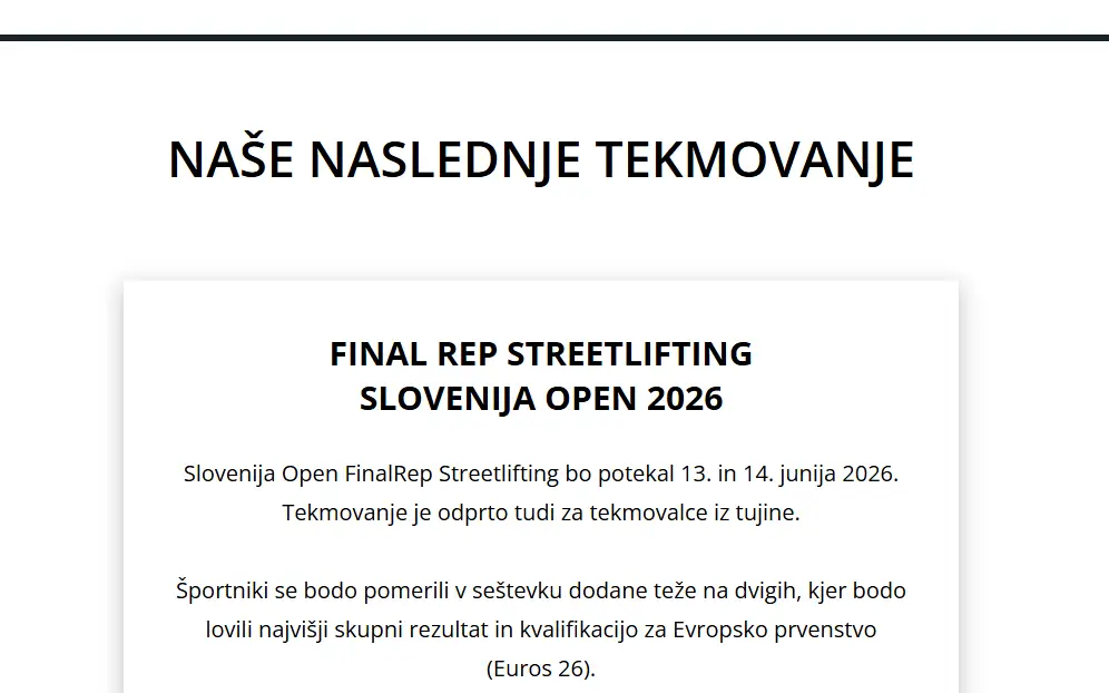
The layout combines structured text with a strong visual element, allowing users to quickly understand the event while maintaining visual interest. The section is directly accessible through a call-to-action button in the hero area, enabling quick navigation to the featured event.
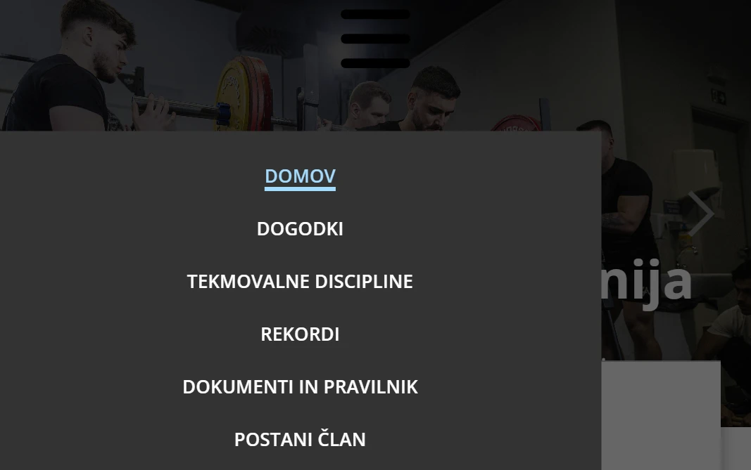
This feature introduces a mobile navigation overlay designed to provide clear and accessible navigation on smaller screens. The menu is triggered by a button and displayed as a full-screen overlay, allowing users to focus on navigation without distractions.
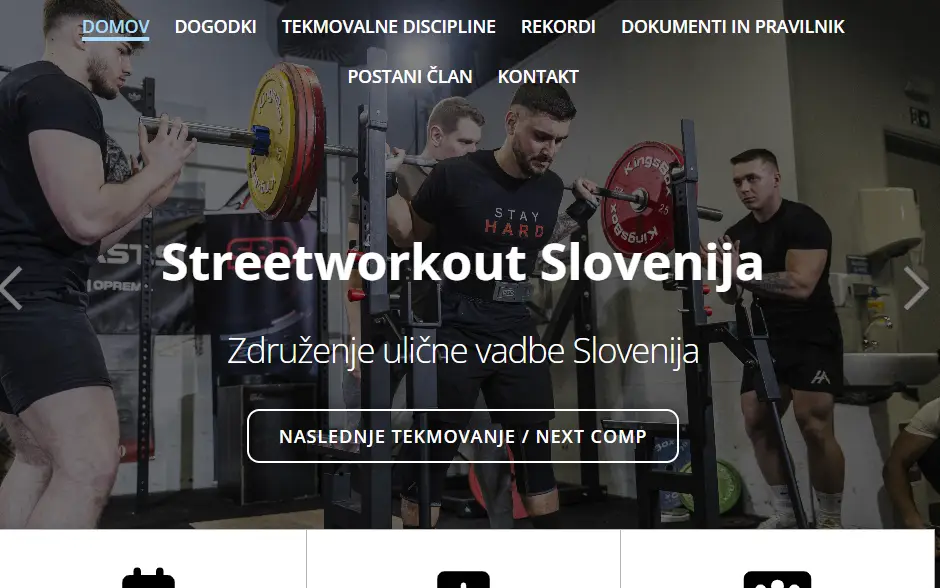
The visuals focus on creating a strong and dynamic experience through bold typography, high-impact imagery, and clear call-to-actions. Large headings and strong contrast help emphasize key sections such as events and membership, while imagery adds energy and context to the content.
I specialize in transforming complex design visions into fluid, high-performance Webflow sites. From custom interactions to clean, scalable CMS structures, I bridge the gap between creative strategy and technical execution.
View live site